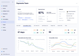
Redesign of a Silicon Valley tech startup raised $11M+ of investments
We optimized the tools for workflow automation and alert management, which improved the processes and increased the efficiency of the entire platform.

We optimized the tools for workflow automation and alert management, which improved the processes and increased the efficiency of the entire platform.
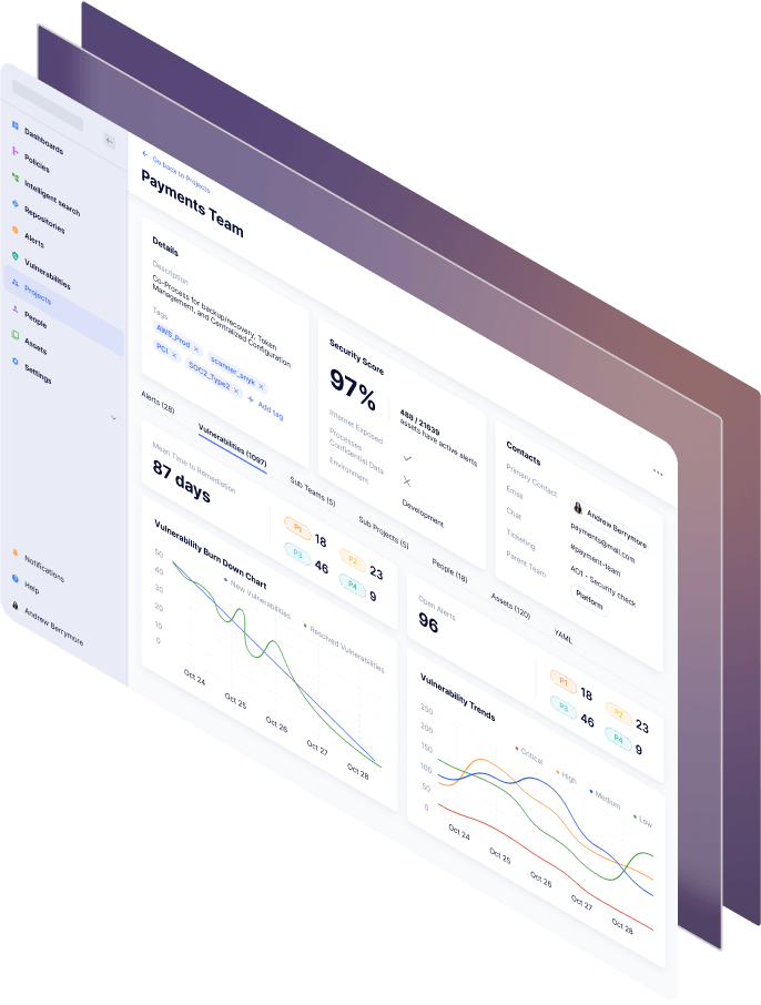
This project is a startup, so new requirements appear as soon as the client gets new feedback from their users. Our approach is flexible, so we select the most suitable methods to provide value and quality on each stage of the project.
Security teams often get frustrated from trying to keep up with endless lists of bugs. That’s why the clients decided to launch their own startup and improve the security workflow.
The clients came to us after working with another design team. They started with an MVP and wanted to continue working on new features. Our task was to create UX and UI design for the new requirements, while maintaining the established design system.
After we gather enough information about the requirements, we proceed with wireframing and prototyping. We use Figma to build all the screens and link them into a clickable prototype. We take advantage of responsive auto layouts, reusable components and variants, to make design flexible and easy to implement.
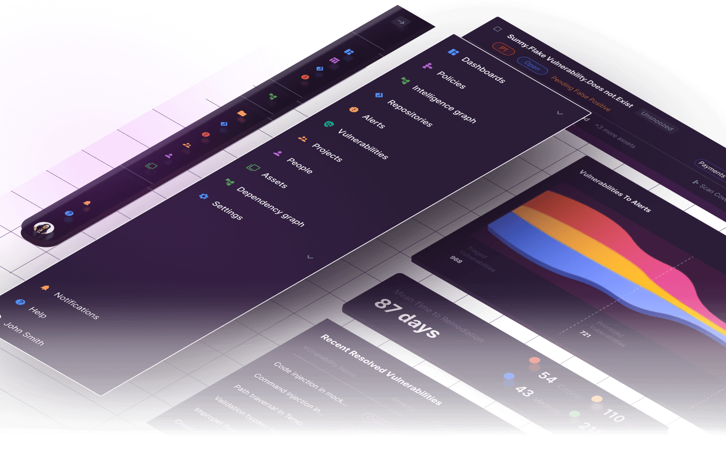
We chose a font Rubik for this project because this font goes is a sans serif with slightly rounded corners and this font is well readable both large size and small size.


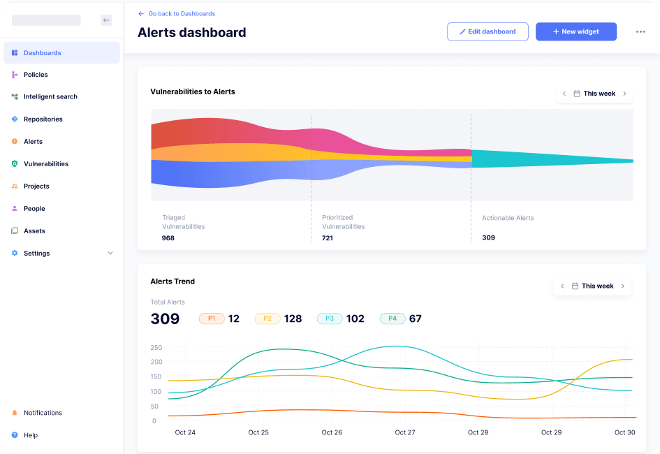
Security teams receive hundreds of vulnerabilities from automated tracking software, but most of them are very similar and bring no additional value to the user. Filtering the important vulnerabilities manually takes a lot of time and effort.
The application uses sets of pre-defined rules to group vulnerabilities into actionable alerts, which are easier to manage. As a result, users can focus on important security risks instead of filtering vulnerabilities manually. Our task was to show the value of this feature on the dashboard. We used a funnel chart to show the large input of vulnerabilities compared to the small output of alerts.
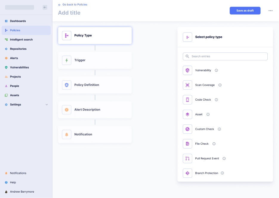
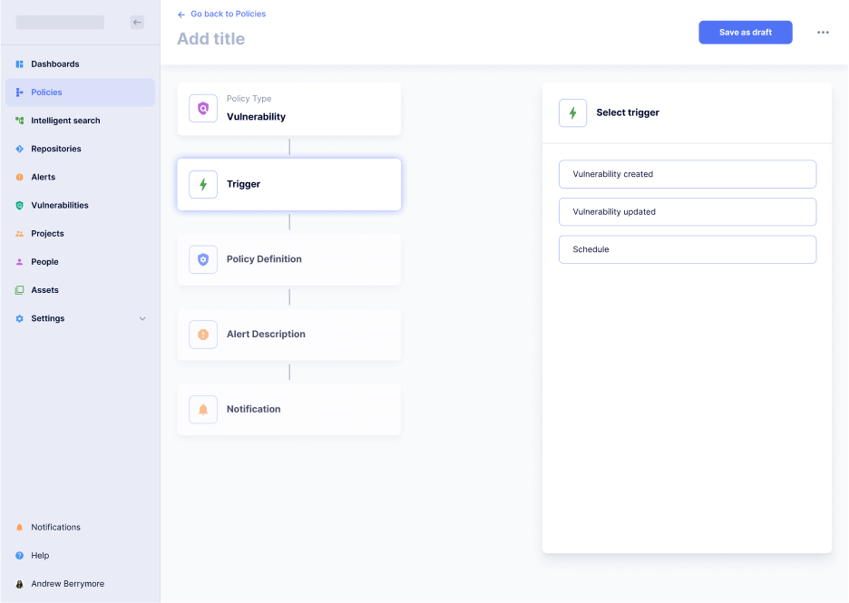
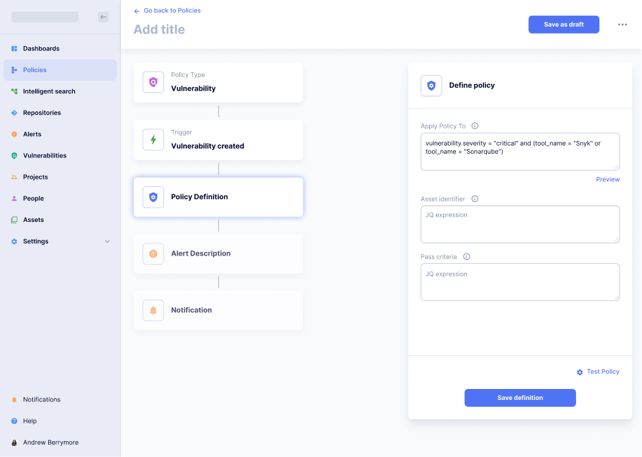
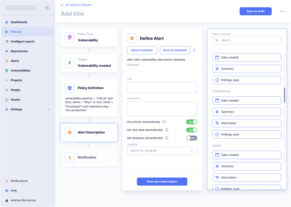
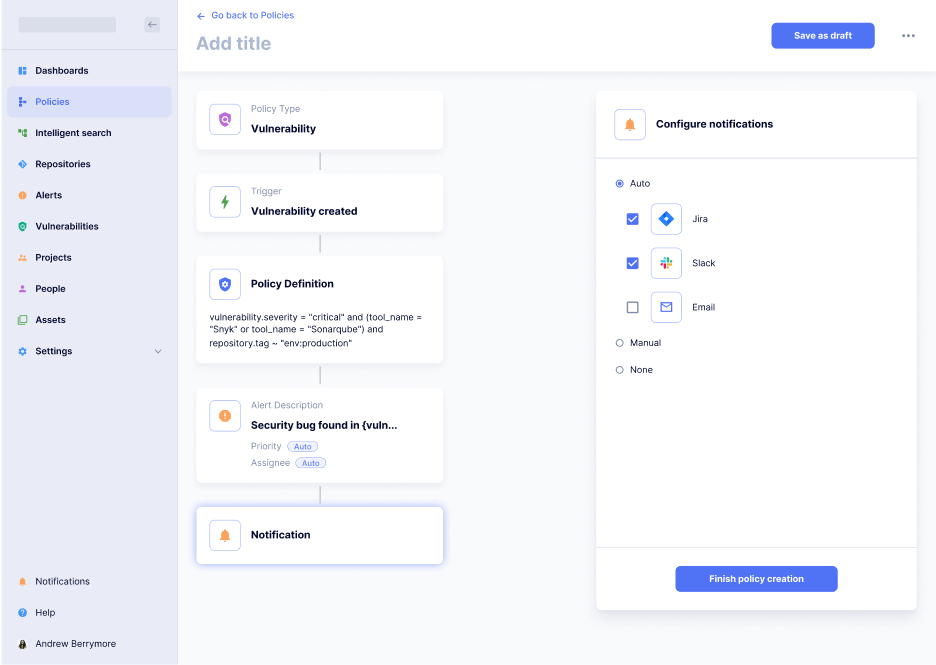
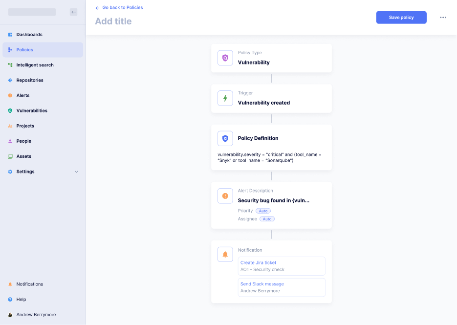
Users can create their own sets of rules to define alerts. This process is highly customizable and includes many different steps. Our task was to make the layout simple and user-friendly, while keeping all the advanced features.
We built a step-by-step flow, which allows users to create their own alerting policy. The users can see all the steps and navigate between them. We also introduced shortcuts, such as templates and auto selections, to eliminate unnecessary repeated actions.
Elements are simple entities, they consist of bases. Not independent and often found in different cases and modules. They do not carry the semantic load by themselves. Are more technical entities.
Components are intermediate entities between patterns and elements. If you divide the pattern into entities, you get a component.
If you combine elements into some entity, but it is not completely independent, as a pattern, it is a component.
Yevheniia Klysha
Lead UX Designer
Olesya Vdovenko
Senior UX Designer
Eugeniya Zhuravlyova
UI Designer
Oleksandr Belkin
Project Manager
Olha Kirdiaieva
UX Designer
Fill out the form to start the conversation — we’ll get right back to you
Thank you! See you soon
We use different types of cookies to optimise your experience on our Website. Click on the categories below to learn more about their purpose. You may choose which types of cookies to allow and can change your preferences at any time. However, be aware that if you choose to refuse or remove cookies, this could affect the availability and functionality of the Website. You can learn more about how we use cookies by reading our Privacy Policy and Cookie Policy.
We use cookies in accordance with Article 6 GDPR based on the following grounds:
a) consent of the user;
b) legitimate interest of the Company.
We collect the necessary cookies based on our legitimate interest, namely to ensure the functionality of the Website.
Categories of cookies:
First-party cookies are those cookies that are placed on the Website by the host of the domain, in particular Angle2 Agency.
Third-party cookies are those that are placed on the Website by the domains other than the one the user is visiting. As a variety of features that are necessary to ensure the personalised and convenient experience of the user may not be delivered by the Website itself, the third-party cookies are used. We work with different third-party service providers in order to enhance your user experience and to analyse user behaviour on our Website.
Third-party service providers may use their cookie files on our Website and you may find the relevant information about the use of cookies by them in their respective privacy documents. The list of the above-mentioned service providers is the following:
c) Google Analytics;
We only use cookies for the following purposes:
Necessary Cookies
We use these cookies to enable the functionality of our Website. You can choose to block Necessary Cookies in your browser settings. Nevertheless, remember, if you block Necessary Cookies, it may strongly affect the functionality of the Website.
Statistic Cookies
We would like to use them to understand how users interact with our Website (number of visits, behaviour) by collecting information anonymously.
Marketing cookies
These cookies and other tracking technologies are used to deliver relevant online advertising to you on other websites. These cookies are placed by us and selected third parties and enable adverts to be presented to you on third party websites.


