Electronic Medical Records (EMR) and Electronic Healthcare Records (EHR) are some of the most breakthrough methods to implement digitalization in medicine. We witness impressive EHR/EMR adoption rates of 89% in 2021. To succeed in the digitalization process, healthcare institutions should never neglect the usability of EMR interfaces.
This article discovers what makes the usability of EMR user interface design one of the key factors in EHR/EMR adoption and offers meaningful tips for EMR interface design aimed to create a superior user experience.
Market Snapshot
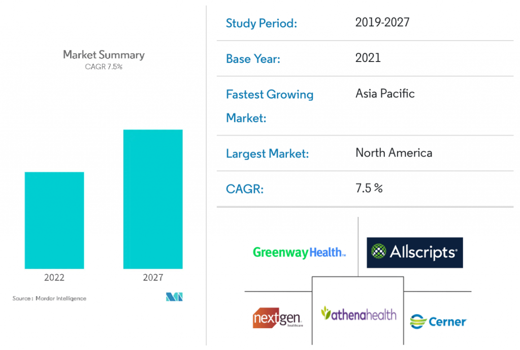
The overwhelming trend towards digitalization makes electronic medical record systems highly demanded. Therefore, the forecasts for the EMR penetration are more than favorable. The market is estimated to be growing at a CAGR of 7.5% till 2026.

Government directs multiple initiatives to encourage medical caregivers to implement electronic health records. The other drivers of the EMR market growth include the increasing need for an integrated healthcare system, the pervading trends of big data in the healthcare industry, and modernization of data storage.
Which factors can reinforce the penetration of EMR and EHR systems? The usability of electronic medical record user interface design is definitely among the most significant ones.
Why Does Electronic Health Record Usability Matter?
The Healthcare Information Management Systems Society (HIMSS) defines the usability of an EMR as the efficiency and satisfaction with which users can fulfill their tasks in a specific environment. Essentially, good usability means convenience and ease of use. It is intuitive, allows to perform tasks promptly, and requires a minimum mental effort.
Why is EHR usability paramount? The right EMR user interface greatly affects productivity, security, satisfaction of all stakeholders, clinical burnout, and even profitability!
EHR usability problem is one of the reasons why the penetration of these systems in the medical field is slowed down. Conversely, better usability can address the main EHR/EMR implementation challenges. Let’s have a more precise look at the ways how an efficient electronic health record interface design enhances operations in medical institutions and elevates user experience.
Higher EHR adoption rates
The carefully developed interfaces of EHRs automate access to information, thereby streamlining the clinician’s workflow. Furthermore, it supports such care-related activities as evidence-based decision-making, quality monitoring, and results reporting. Therefore, the efficient design of electronic medical record user interfaces pushes the EHR market forward.
Less clinical burnout
Clinical burnout is one of the primary concerns for many healthcare organizations. EHR usability is strongly linked with this threatening occurrence, which is confirmed by the research. How can EMR interfaces help mitigate the issue?
- Reduce disruptive alerts for medical specialists. EHRs screen design can be configured to show different visual alerts instead of the conventional notifications, which would be addressed to differing caregivers.
- Save physicians’ time. Voice-enabled add-ons allow dictating notes directly into the EHR, and even transcribing patient visits.
Increased patient safety
The absence of high standards in the design, development, and implementation of EHR products can lead to patient safety issues. Cluttered electronic medical record interfaces and a complex medication list are the common factors that may cause safety events. Therefore, a proper EHR interface design that includes a clean data entry process is paramount to ensure EHR data integrity and patient security.
Fewer errors
EHR systems can incorporate features that display alerts for potential drug interactions and adverse effects. EHR database capabilities can also speed up the practitioners’ job by allowing instant research of any drug, its side effects, and contraindications. Overall, the proper design of EMR user interfaces can reduce medical errors by more than 50%.
10 Tips for Designing an EHR / EMR Interface
Crafting an efficient EMR interface system involves experienced users, complex functionality, and critical tasks. By implementing usability in EHR/EMR interfaces, institutions can counter these challenges. Consider the following EMR interface design tips to optimize your implementation process.
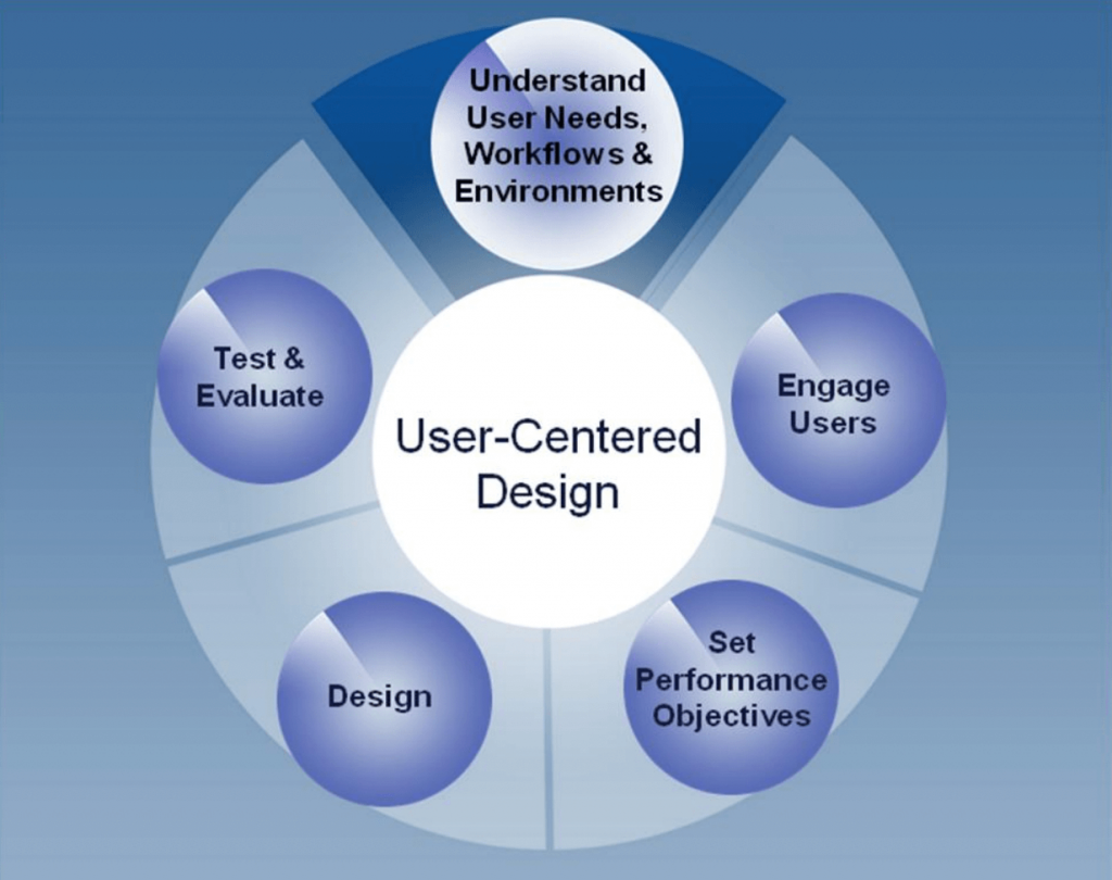
1. Focus on the user-centered design

This is one of the essential EHR interface design tips that shapes a successful start of the user’s interaction with your EHR.
- Know your users. You will basically have 3 types of users for your EHR: a doctor, a nurse, and a front desk person;
- Understand user needs, pain points, and work environments;
- Engage users early and often;
- Design the user interface based on human behavior principles and user interface models;
- Perform usability tests to determine whether the interface corresponds to user needs;
- Continually test the design with users and optimize it.
2. Range your tasks by their importance
Since you cannot design/redesign everything in a huge system, focus on the primary tasks. Start with modules, such as patient card, your launch is impossible without. Usually, such modules embrace all types of users: a doctor, a nurse, and a front desk person.
3. Prioritize simplicity and clarity
Your EHR user interface design should ensure quick and simple operation.
- Make the setup and operation as easy as possible. Add contextual prompts and troubleshooting to guide users.
- Range tasks by only demonstrating what is needed at a given time.
- Minimize manual input of data. For instance, set up an automatic pulling of data from EHR systems, or add automatically filling-in text fields.
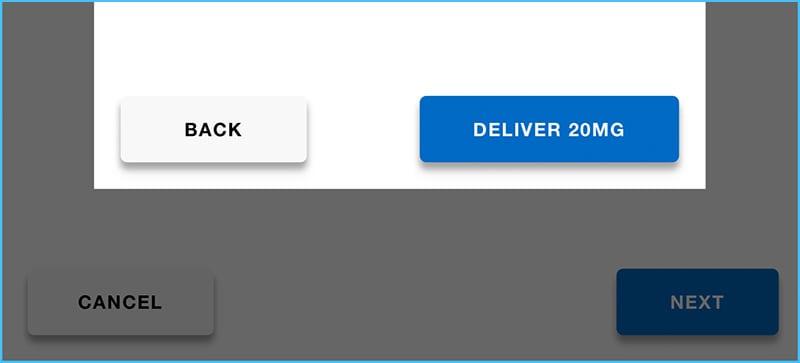
- Use confirmation actions for critical tasks. Place the buttons for critical actions away from the areas of frequent touch.
- Make sure all vital information is perfectly visible and clear during tasks.
Example of a critical action:

4. Find out which devices your users prefer
Consider the device specifics in your design process:
- Should you focus on the touchscreen devices or incorporate physical knobs?
- Do not overuse scrolling, as it may be inconvenient in emergency situations. Properly designed interfaces will display only what is useful at a given time.
- Make the main targets and clickable items easy to find.
- Ensure the readability of your fonts, maximize the differentiation between numeric values, and provide the proper viewing distances.
5. Use colors purposefully
Make sure you follow these tips:
- Colors should comply with the provisions of the Americans with Disabilities Act.
- Alert states should be denoted only by yellow, orange, and red.
- Use neutral backgrounds. Black backgrounds may suit dark environments.
- Check your designs on the relevant hardware, since the colors may look different on different screens.
6. Avoid mental load
Excessive information can confuse and overwhelm the user. A proper UX oversight will help you ease the task for your client.
- Leave only the necessary elements in your UI. Remove complex diagrams and redundant texts.
- Do not present multiple alarms at once. Learn the respective ISO guidelines.
- Guide the user with the help of the right focuses.
- Include a standby mode; some features may only be required during the interaction with the device.
7. Create a clean look and feel
Use a simple, clean style and avoid being too trendy. Also, well-established, intuitive icons are preferable. You should consider the ISO recommendations; however, you may also add your own styling if it is validated via testing. Here is a comparison of some ISO icons with more contemporary Material Design icons:

8. Add value
Always try to think broader and wider than merely creating a medical device that does the job properly. To gain a competitive edge, you should consider greater usage options.
- Research the stakeholders interacting with your product. You will need to interact with pharmacies, insurance companies, banks, and more.
- Do not limit yourself to the primary task. Provide the added benefits by enabling your device interface to guide setup, aid in training, troubleshooting, ordering supplies, and more.
9. Cooperate with experts
Combine your knowledge and experience with those of doctors and nurses. Share drafts and arrange the discussion. It’s cheaper and faster in the first stages.
10. Consider the legal side of the development
The EHR system is supposed to contain sensitive patient data, such as diagnoses, prescriptions, and personal information. Make sure the data is kept securely.
Our Experience in Designing Interfaces for EHRs
We’ll share one of our successful case studies of customized EHR interfaces development.
Challenge
We had to deal with a 16-year-old product that had been created and improved by various professionals throughout its service life. Our goal was to simplify the product’s use while making the development process clear and simple for the client’s team.
Solution
Our working process was split into the following major steps:
- We started by researching the industry and the product.
- Then we created maps for each module and combined them into a unified product map.
- We proceeded with the improvement of wireframe and patient card navigation.
- After that, we selected the right tech stack and developed a clear and understandable UI style.
- We created a design system to make the product more consistent and efficient. The system included rules for naming entities in the system and rules for supporting versioning of the system, a confluence space, and a library.
Results
We addressed the main issue of inconsistency in a huge product. We have developed patterns, components, interface elements, and bases from which everything is built. Thanks to simple and flexible navigation, an extremely comprehensive product became easy to use. We have also minimized the time needed to work with the interface enabling the team members to devote more time to the real patients. Overall, we not only created a new electronic health record interface design but also established a widely re-considered and optimized user experience.
Conclusion
A primary trend across multiple industries, digitalization dictates a continually growing need for the adoption of EMR/EHR in the healthcare sector. Focusing on the usability of the EHR screen design and user interface allows stakeholders to mitigate the challenges and maximize the benefits of the technology.
Although designing a comprehensive EMR system is not an easy job, the ten suggested tips for EHR interface design will guide you through the complicated development process or help you properly coordinate your vendor’s work. Whether you need a customized EHR interface, an existing EMR interface redesign, or the optimization of application interfaces, contact us – we can handle the job with success.


