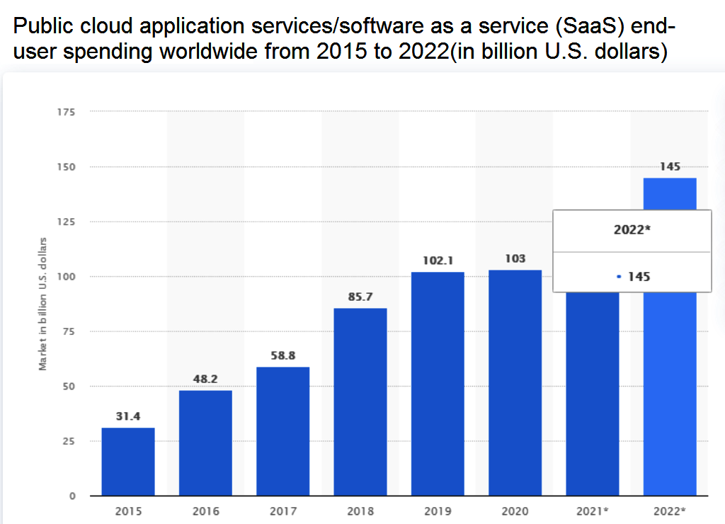
According to statistics, the volume of the SaaS market is approximately 123 billion US dollars, and it is supposed to grow to 145 billion next year! There are several thousand large companies here, which users rate primarily by the quality of their websites. And we are confident that you as a customer have experience of both frustrations and satisfaction from using such resources. After all, only the best saas websites are capable of attracting, prompting for action and converting potential customers into buyers.
Not sure what makes a SaaS website the best one, how to properly motivate users and make your business stand out in a huge market? What is the mystery of success of big corporations with a large number of clients? It all lies in the capabilities of the user interface of their online resources. Get Saas design inspiration from the best examples. Or use proven solutions from SaaS Design professionals.
Motivating SaaS Website Users and Inspiring Creators
From a UX point of view, users of a resource are motivated to action not by the artistic side of design, but by its interactive capabilities. Likewise, when developing the best saas website, designers draw inspiration from more than just the appearance of the main pages. They are more interested in the algorithm and the convenience of using the website. They study the behavior of the system, check what is shown and what is hidden, and how it works. First of all, an analysis of competitors is carried out. We study the strengths and weaknesses of popular products, which are usually the inspiration for our new ideas.
Looking for inspiration from other areas’ saas websites is also a great idea, as many of them have similar principles of work. But you need to understand that the context of the product you are working on is unlikely to be 100% the same. For example, a person can work once a week using our services, while some work 8 hours daily on other platforms. So, you must not forget that there is a difference and that some good solutions may not work for you.
However, inspiration can be found in any other product, not just in the saas examples. For instance, e-commerce invests a lot of resources in developing different filters, etc. Why not use this solution as well? You just need to always think about the needs of your users and try to apply, and not just copy someone else’s experience.
Of course, inspiration is something that can come from any type of source. For example, from books or videos on YouTube. Beautiful Evidence by Edward Tufte and Jakob Nielsen’s interview are good examples of it. So, visualization of information and all kinds of other random things can be sources of great ideas for saas website design.
The point of off-web inspiration is to go beyond charts and samples, and to come up with new solutions. A well-chosen team can also inspire and properly motivate users to work together.
The Year 2021: Best SaaS Websites Practices
You should follow and use best practices for designing SaaS apps and websites. If you want your web service to stand out, you need to apply the following to it:
Effective landing page and navigation
For example, Evernote has one of the best landing pages with a headline addressing user concerns. The following clearly describes how you can help solve the problem, followed by a direct call for free registration. The message is arranged in a way that the user will definitely read it before starting to get acquainted with the rest of the website.
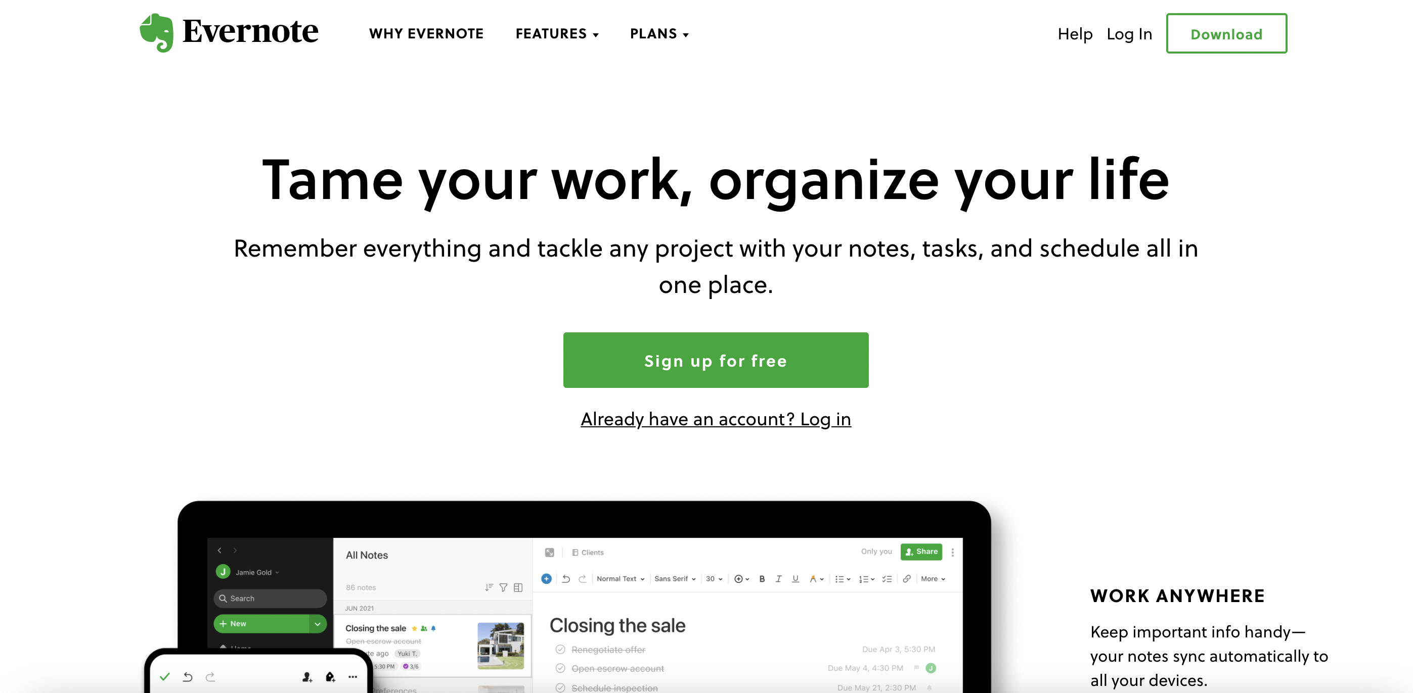
As the user scrolls down the page, he will reveal additional details and information, user stories, testimonials and press releases. The purpose of the page, which is to encourage visitors to register, is achieved really easily. The more time visitors are on the website, the more information they get about the functions and convincing facts in favor of choosing a particular service.
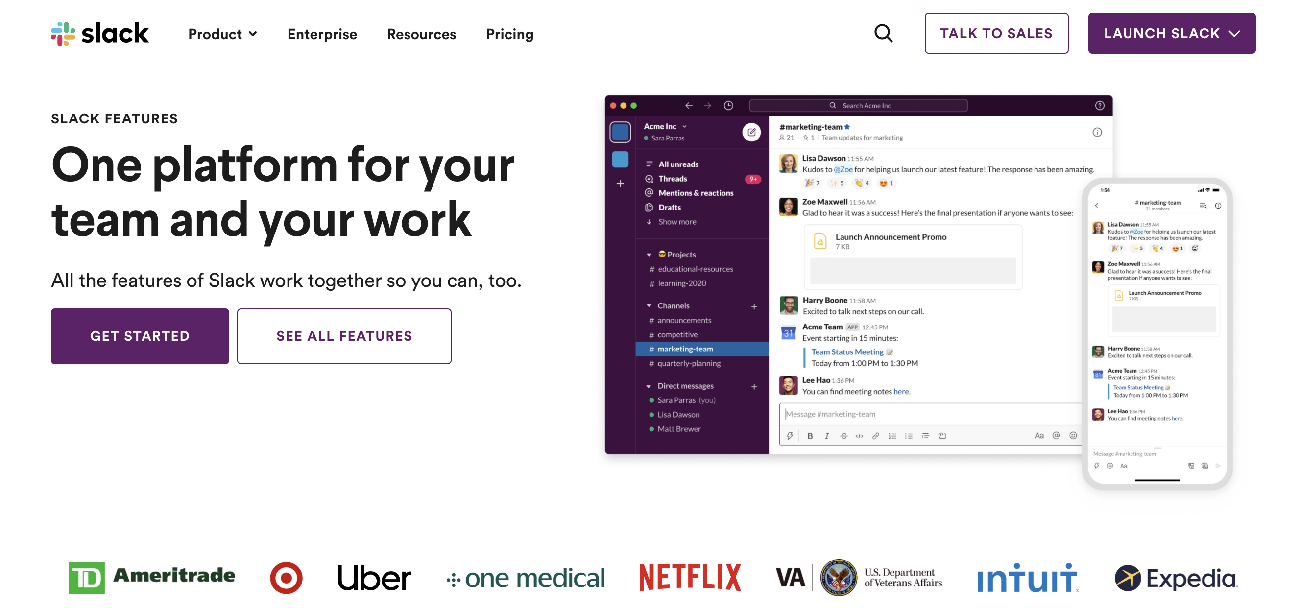
The Slack website is easy to navigate and it has a straightforward call to action. The video on the homepage clearly shows how the tool works with redirecting many messages and topics to specific locations. This is a great example of simple UX design for websites and the best example of quality SaaS app design.
Clear and straightforward design
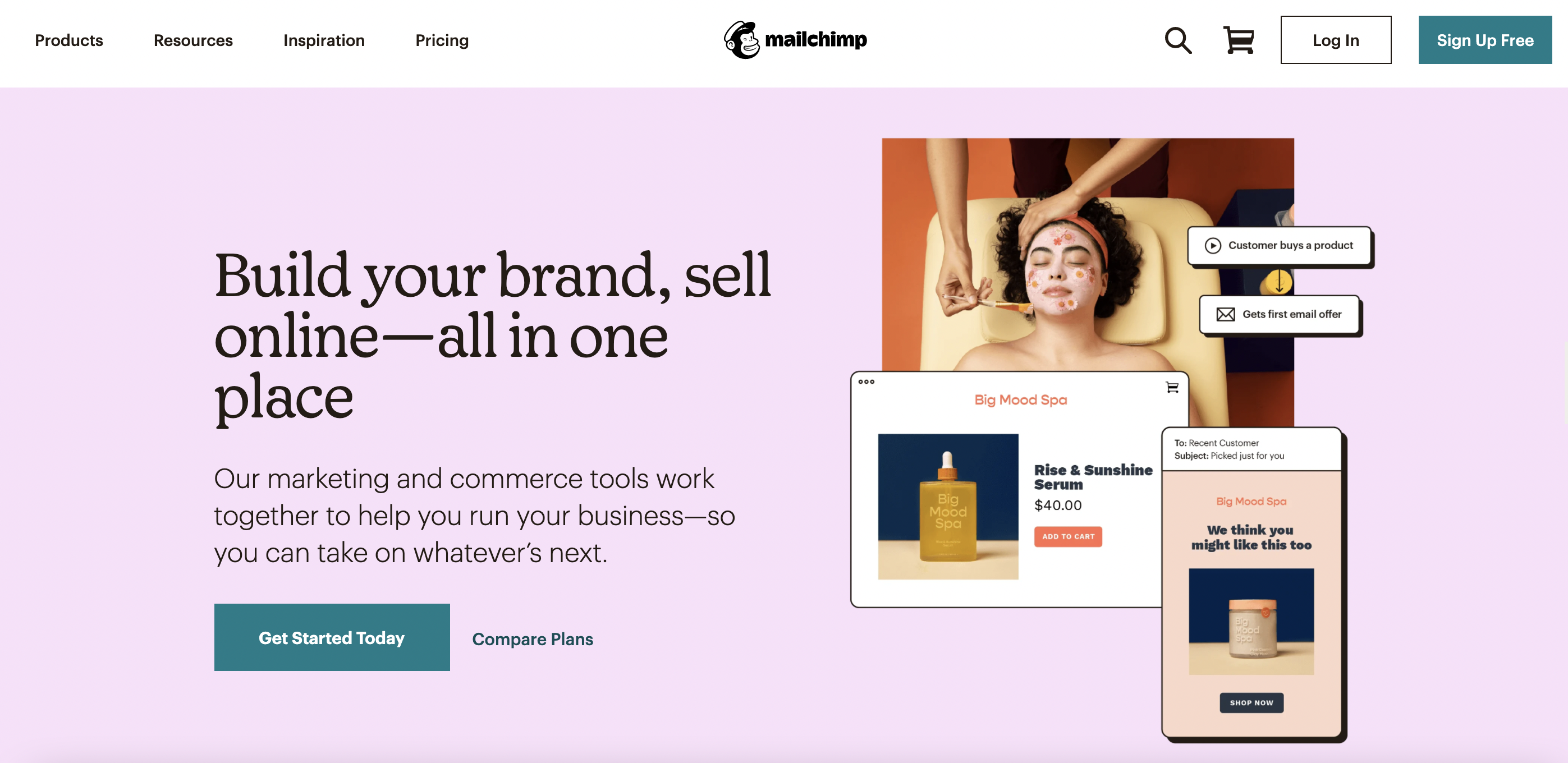
MailChimp – a great example of such a design. Users immediately understand who the service is for. Here’s what the company really did well:
- landing page that gets straight to the point with a big, simple message and a direct call to action;
- clear and concise information about what exactly the service offers;
- simple and intuitive navigation;
- lack of unnecessary information, fanciful animation and graphics.
Simple introduction to a service or product
Dropbox – one of the most popular digital services providing a simple registration form with a clear indication of the company profile and its services. For less well-known businesses, it makes little sense to center the home page around a form that immediately requests user data. It is better to indicate several reasons why website visitors may be interested in what you’re offering.
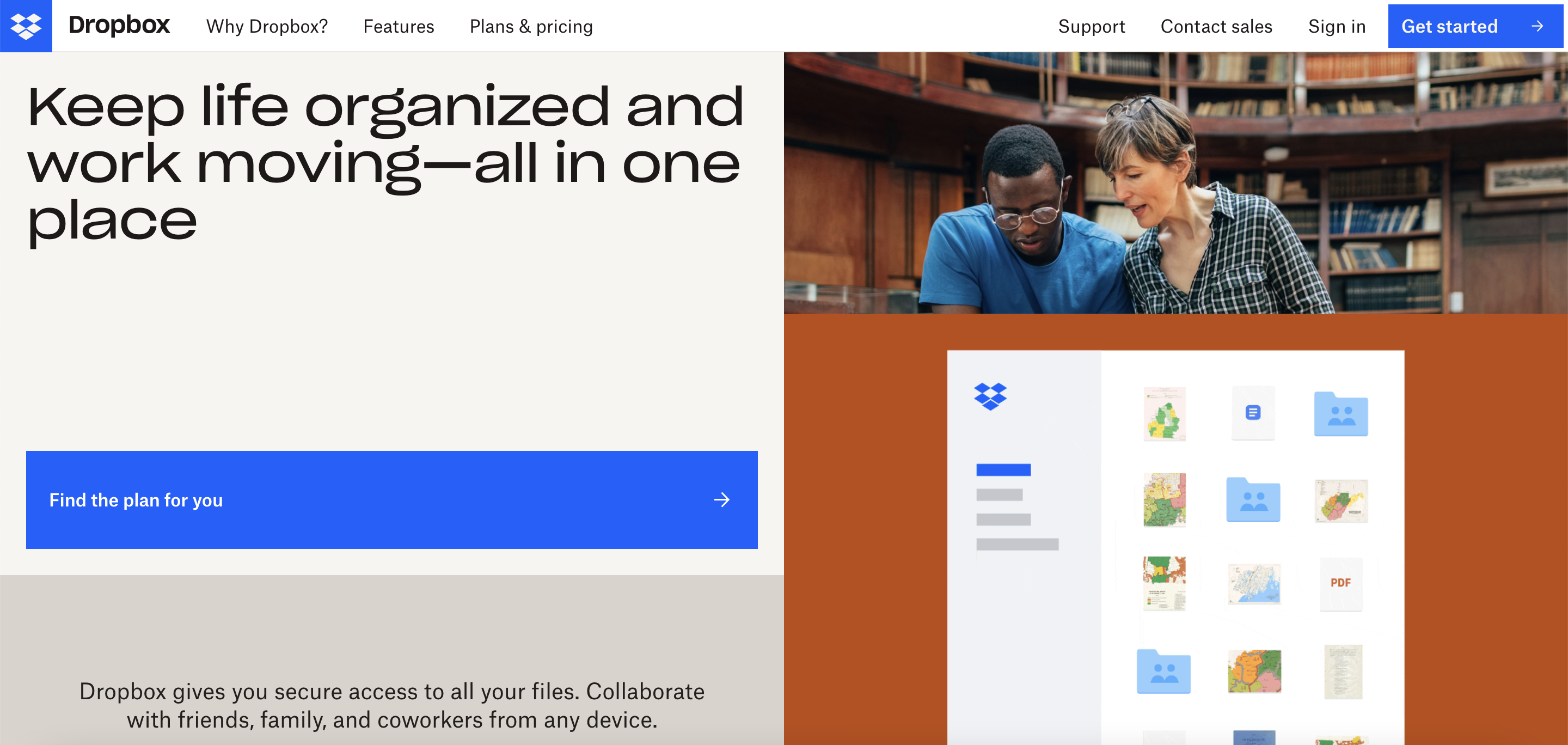
Collect only the essentials, such as your name and email address. Each additional step takes a client away from you. To attract more subscribers, place a strong call to action on your landing page, making the buttons obvious. A great example is Google Apps, which have dedicated their entire first page to it.
Focus on the modern consumers
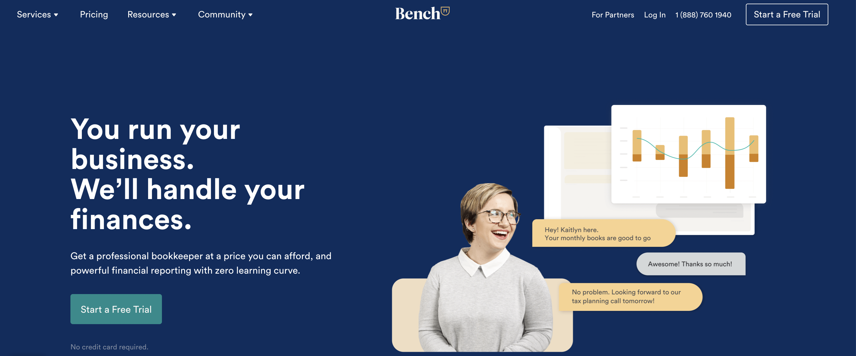
SaaS companies need to accommodate today’s customer needs without losing their unique identity. Bench does a great job at it while keeping it lighthearted and human-centered. The landing page also makes it clear about what services are on offer and has a direct call to action suggesting a free trial right away. The landing page of this service is optimized so that the client doesn’t waste precious time. The company focuses on this feature, which is also reflected really positively in the reviews. Website visitors appreciate such clear messages. They can instantly register or start scrolling to learn more about the benefits of the service.
Another worthy example is Kissmetrics. Like many of the best SaaS websites, the design is simple and easy to read, and users can figure out with no problems what services are on offer. Pages are not cluttered with unnecessary information, and the layout encourages scrolling to find more additional information.
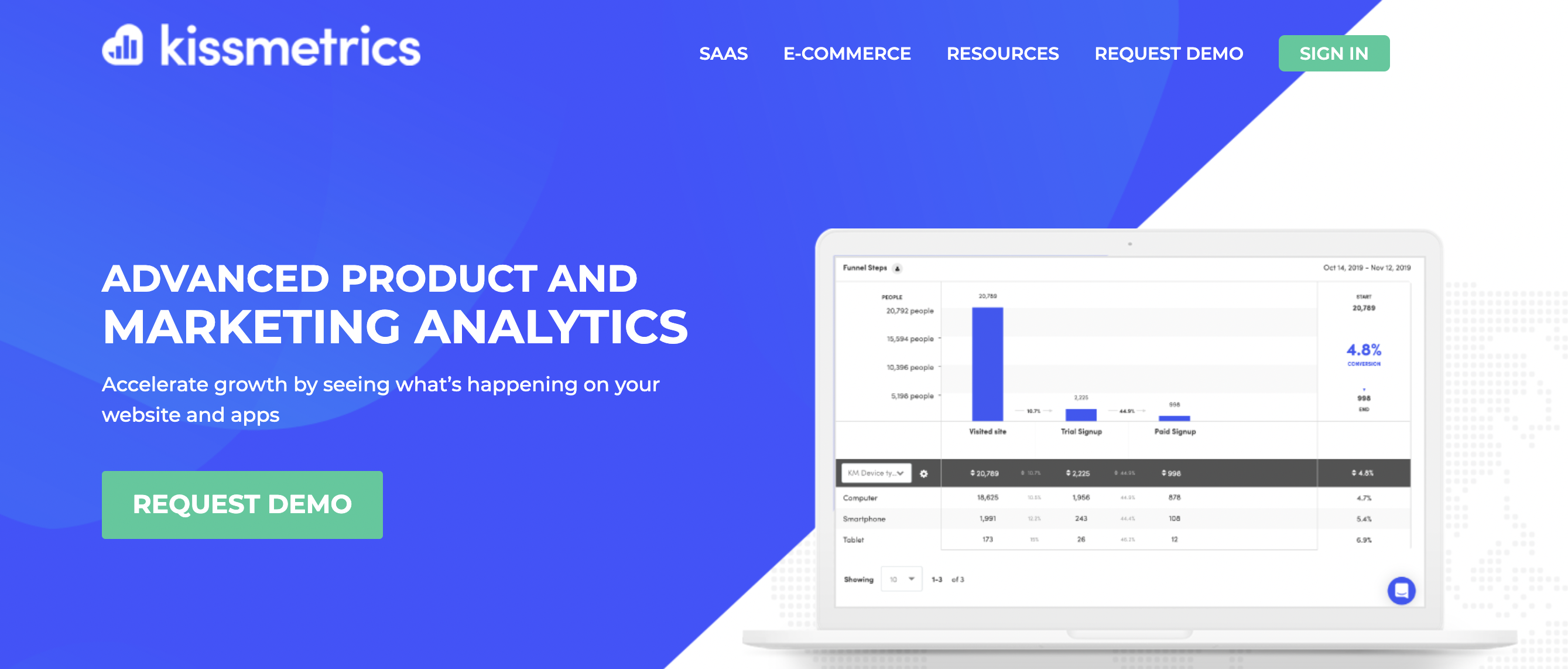
This builds the trust of potential customers towards such websites. Of course, it is always better to move the call to action to the most prominent place. And it would also be a great idea to add a drop-down menu to the start section asking for a demo and suggesting immediate registration.
Dynamic sorting
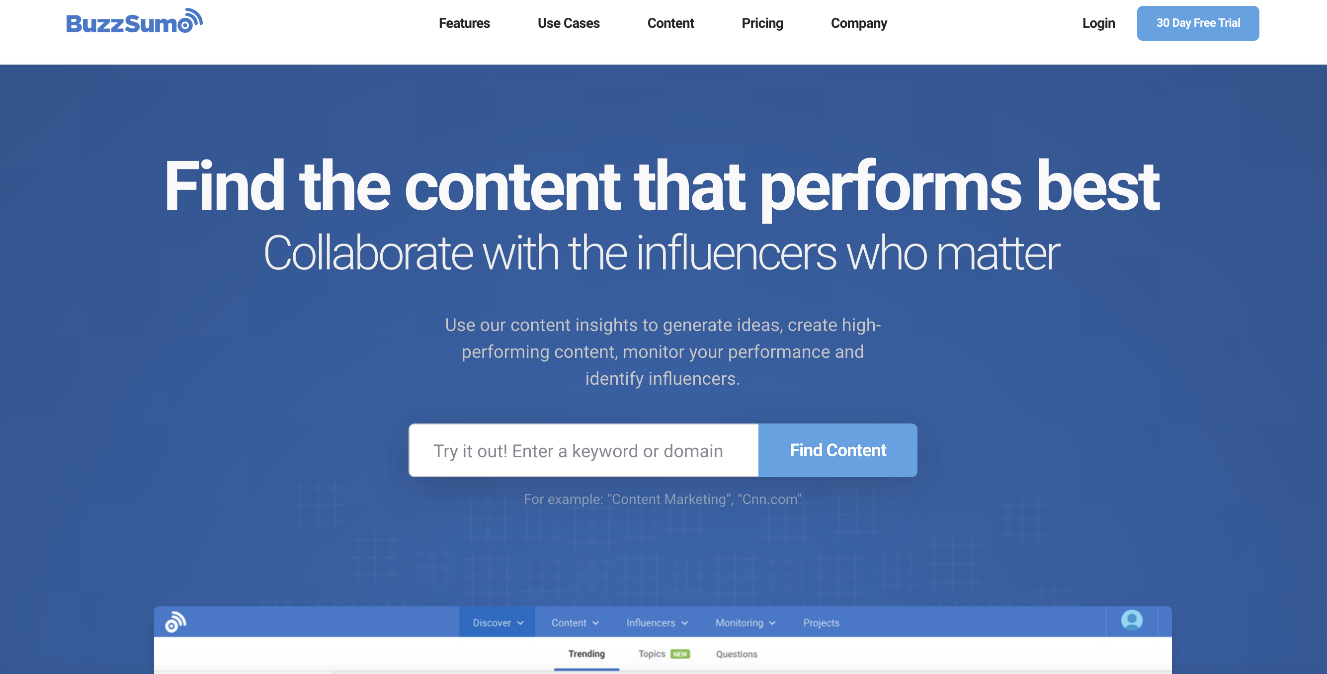
The search bar is best to be located at the top of the home page. It’s also a good idea to include it in the dropdown menu bar so it doesn’t clutter up the interface.
BuzzSumo – a great example of dynamic sorting implementation and one of the best saas website examples. The search option allows you to search for some very specific information on social media. You can even define time frames as well as the type of data, such as which social media it comes from, etc.
Attractive image
Your suggestions should immediately make an impression of top saas products. Users love to feel that the website was created just for them. Provide them with a first-class service by making it easier to reach company representatives, for example by adding an online chat window with someone from the office responding on there, or using a chatbot. This will help you collect suggestions for further improvement of the resource. The FAQ section is also important for those who prefer self-help to direct communication.
Involving clients in the design process
All successful companies know how important it is to keep in touch with their customer base. Let them help make your website better. Use social media for this, conduct surveys, initiate discussions, and actively participate in the public discussion of your services and products.
Focus on developing all the most important features for your target audience. While a SaaS product should be appealing to everyone, don’t forget who it has been created for and who are your potential customers. You can easily expand the range of services provided by customizing the registration process for different types of users.
Simple payment
When your customer decides that they like the free version of the product, they are more likely to want to pay for it and make their purchase. Make sure your customer has everything to do it easily on their own. For example, the best software websites have a page with step-by-step instructions. You can also make the process as simple as possible. As discussed earlier, an extensive list of frequently asked questions should be at an easy reach and the answers to them readily available.
Continuous product updates
Your project will grow and develop as you gain more users. But such a process always requires UI / UX improvements and upgrades. Only in this way will the class of your website correspond to the scale of your business. Social media and polls are your best friends with this task. Respond to user requests and give them what they deserve.
Whenever the user requires additional information to make an informed decision, a well-thought-out system of help and documentation should be included in your project. This will help improve an already excellent and great product. Help should be provided to the user in a timely manner and whenever it is requested. If you are using an FAQ or Help page, it should always be easy to search with hints, so that users spend as little time on there as possible. Getting accurate and immediate help builds confidence in the product, makes your users happier and makes you more successful.
Conclusion
You may have noticed that the saas website design of different successful companies has a lot in common. It is clean, simple, straightforward, beautiful, spontaneous and reflects their corporate values. Each page also has a clear call to action – the fastest and easiest way to get more information. Visiting such resources, the users immediately understand what the offered products and services are needed for. They can quickly figure out whether they need it or not, and have the opportunity to immediately use them.
Of course, creating an exemplary design isn’t an easy thing to do. But the real value of your business, which is usually reflected in user preferences, will depend on its quality. If you are unsure of your own abilities, we at Angle2 have extensive experience in UX audit and SaaS user interface design. Contact us with your project idea to get an estimate or a consultation.


