Web design is not a cakewalk affair for a layman to handle so serious e-commerce entrepreneurs hire seasoned professionals to eventually receive a top-notch site. Yet, even within this highly specialized sphere, there are some jobs that even experts might have trouble with. One of such tasks is designing highly intricate interfaces for B2B or Enterprise. Alongside research issues, this kind of assignment involves, there are some nitty-gritty details that one must pay attention to while setting about such complex app design.
The Underestimated Importance of UX
One of the popular myths about developing Enterprise or B2B systems is that designers shouldn’t try hard to make the site or app user-friendly. There is no point in pleasing the audience since the personnel who work with this software aren’t the decision-makers opting for this or that app. They get their salary to employ the software so they will get the knack of using it sooner or later. Such a train of thought is a totally flawed one. Just imagine the time the staff spends (or wastes?) learning the ropes, adopting trial and error modus operandi and botching some tasks while doing it.
Consequently, some simple assignment takes them forever to complete which ultimately loses their employers precious time and money. The astute managers and business owners will eventually notice their employees struggling with the system or – worse – will have to splurge on correcting the mistakes. Moreover, their business reputation will suffer a grievous blow which is hardest to redress, so they will think twice before addressing the app creators again.
Digging Deeper into Users’ Profiles
The user-oriented approach must become your priority when you build a complex system like that. Envisaging specialists who will interact with a certain part of the interface (or delegate some job to others) and who they will communicate with as far as the system is concerned is crucial for the success of the final software product.
To get a clear picture, our company experts start their work on the project by drawing journey maps that reflect the workflow responsibilities of every employee and observing the touch-points where they overlap. Having this roadmap in front of us, we can shape our course correspondingly and even split the interface tailoring it for the unique requirements of various users.
Collecting as Much Information as Possible
Preliminary research must be employed regarding not only the potential users. All pertinent data should be taken into consideration, with the relevant documentation and reviews coming under scrutiny. Naturally, for such complex projects, the bulk of accompanying data is going to be quite substantial, but the developing team must be prepared to look into it not to compromise the quality.
Clients may chafe at the fact that the development process that has been underway for quite a time hasn’t yielded any palpable results. Yet, it is the task of project managers to get it through to them that it is the price they have to willingly pay to get the first-rate output.
System Logic Reigns Supreme
The more complex the interface is, the harder it is to keep it logically uniform. Maintaining consistency of elements and interactions is extremely time-consuming, so you should have a list of deliverables handy that will ensure you don’t leave any important detail behind. Typically, such an inventory is to include the information architecture (aka entities list), the flowchart, the site map, and any other document that will help to control the integrity of the system.
Setting the Right Priorities
In complex projects, you should be ready to sacrifice some non-essential functions in order to enhance the interface usability. Yet, to build a high-class app customized to the unique needs of the client presupposes some tough choices and thinking outside the box. Sometimes, a combo of new approaches and old-school practices works miracles.
Leveraging Prototyping Tools
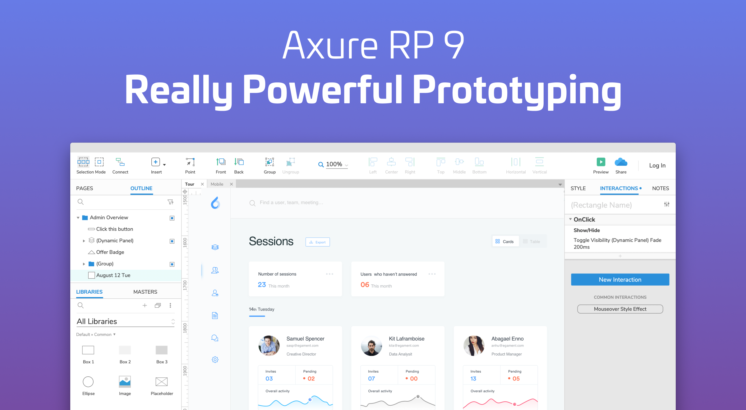
While creating a multipage project, you must anticipate issues with navigating countless screens and showing numerous drop-downs. Conventional tools (for instance, Sketch+Invision with their limited functionality) can’t render satisfactory performance in this respect, so it is wise to opt for good old Axure to do the job. Moreover, unlike Invision, this tool can be instrumental in testing complex interactions that huge systems abound in.
Realizing the Need for Speed
Enterprise and B2B interfaces are products meant for daily wear and tear, so promptness of performance is oftentimes the principal value for them. Consequently, whatever speeds up completing routine tasks and automates mundane jobs is in high demand with their users. So it is expedient to opt for quickness and employ shortcuts aplenty even if easiness eventually suffers.
Conclusion
Being labor- and time-consuming projects, complex applications and B2B systems are to be developed with close attention paid to reducing support expenditures and the ability to adapt to shifting environment conditions. Software producers are starting to realize that comfortable UX is essential for products of this type and can give them a significant edge over their less wieldy counterparts in a time of intense competition on the digital market.
Looking for UX designers to handle complex app design? Contact us with your project idea – we’ll be happy to help.


