The current trends of civilization development are conditioned by two major factors: pervading digitalization and the aftermath of the global pandemic. These two determinants account for the across-the-board transition to remote and e-formats in all industries.
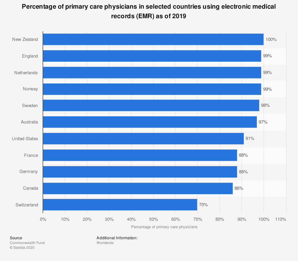
In healthcare, this drive spells an ever-growing advent of virtual and telemedicine as well as the widespread introduction of electronic medical/health records (EMR/EHR). Such systems are becoming ubiquitous, with clinics and doctors increasingly relying on high-tech achievements to streamline their workflow and enhance the quality of providing professional services.

Being a novel technology, it involves a number of issues and EHR usability is the mission-critical one. But before zooming in on this aspect of the system, it is necessary to take a closer look at this state-of-the-art product.
EHR Systems in Healthcare: Pushing the Medical Envelope
For decades and even centuries, the interaction between patients and doctors resulted in keeping detailed ledgers that contained information about people’s medical case histories. As a patient got older and their ailments accrued, these notebooks grew into bulky binders extremely inconvenient to carry along and handle. And if such a history was mislaid or lost, it took stakeholders a lot of time and effort to restore all the data it contained.
Well, these awkward times are now gone for good. since the current medical industry is adopting a comprehensive EHR experience instead of paper charts. These are secure real-time digital records pertaining to a patient’s condition and previous history that are available to authorized persons (doctors and nurses) and organizations (laboratories, pharmacies, school clinics, emergency facilities, etc.).
Being seasoned EHR developers, we at Angle2 believe that a high-profile system of this kind should contain contact and insurance information, family history, records of visits to doctors, hospitalizations, and undergone surgeries/procedures (vaccinations included). Looking into it, healthcare providers must be aware not only of the past and present diseases of the person but also about the medications (s)he took/takes and allergies (s)he has.
Having such data at hand, clinicians can store, retrieve, and update relevant information (including links, images, videos, and other multimedia files) as well as promptly share it between multiple locations and stakeholders. As a result, diagnoses and treatment plans are dealt around faster through more knowledgeable data-driven decisions, so that patients save precious time which can be crucial for their quick recovery and even life. Moreover, efficient EHR enhances standardization of services, rules out the redundancy of effort (for instance, duplications of tests or radiology examinations), and curtails the probability of medical error.
Ultimately, all the enumerated EHR benefits aimed at streamlining and even automation of healthcare workflow bring about a significant reduction of the medical care cost and higher quality of services rendered by clinicians.
The contemporary view on EHR systems presupposes the transition from their understanding as a mere collection of medical records to the creation of comprehensive healthcare platforms. Using them, clinicians can issue medication orders and test requests. Patients can access information on available doctors and services and schedule an appointment with a necessary specialist. Thus, all stakeholders keep in constant contact, which enables effective communication and swift access to data and services.
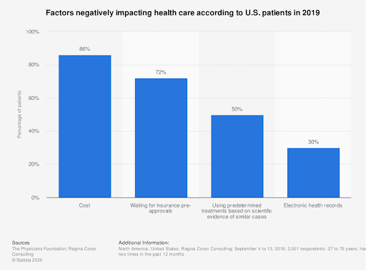
Being overall a tremendous improvement as a concept, EHR has still a long way to go to live up to the expectations, with about a third of patients assessing negatively its impact on health care.

In the view of our experts, such a backlash can be explained by numerous complaints related to the usability of EHR.
Usability of Health Information Systems Scrutinized
Any system usability (and EHR is no exception) is described as efficiency in catering to the needs of users who can satisfactorily accomplish particular tasks in a specific environment.
Ideally, EHR is supposed to be intuitive to master and easy to operate. It should enable people who work with it to perform a set of missions with minimal cognitive effort, quickly, and error-free. Plus, achieving the desired outcome should take any person (be it a patient or a hospital employee) the smallest possible number of steps.
The mentioned requirements are not something above-the-head but rather ordinary, so implementing them into a digital product appears to be absolutely doable for the savvy software developers of the third decade of the 21st century. However, the majority of existing EHR solutions seem to fall utterly short of hopes healthcare providers entertain. As a study by the American Medical Association and the Mayo Clinic argues, on average they award it an F grade on the letter scale.
The vague frustration of physicians exposed in this survey has been vindicated by the numbers that the System Usability Scale (SUS) reveals. According to polling results, the average usability index of various EHR solutions is 68 out of 100. Not that poor in comparison to the previous assessment, but way too low (inferior to that of Microsoft Excel or even a microwave oven!), given the paramount impact it has on human health.
What are the most popular complaints concerning the usability of health information systems voiced by disgruntled users?
EHR Usability Issues
As a rule, all usability bottlenecks are related to two kinds of problems: how the information is displayed (underlying interface and design shortcomings) and how it is accessed (information support issues).
- Naturalness. This one has a two-fold meaning. It refers both to the correspondence of the system to the natural workflow of the medicare institution and the appearance of information on the screen in the natural sequence.
- Consistency. Identical user actions should lead to the same results across all elements of the UI.
- Interoperability. Components of EHR systems have problems in communicating with each other, still more to their counterpart systems.
- Ineffective interaction. The personnel working with EHR has to perform too many steps to get the assignment done.
- Insufficient or absent feedback and alerts. Users aren’t updated on what is going on and alerts they are supposed to receive are either lacking or incorrect. Sometimes, the feedback messages use ambiguous language (terms and abbreviations) that confuse users and hamstring the speed of care providers’ functioning.
- Data entry and retrieval. The process of data entry is too complicated or difficult. And data access and retrieval are considerably handicapped since it has been stored in an obscure location.
- Presentation of information. UI design is deficient in terms of the arrangement of visual information as well as its nature and amount.
- Flexibility. EHR systems should be customizable to be tailored to fit the unique needs of each clinic.
- Error prevention. Some typical errors must be forestalled and avoided.
How can all these issues be handled by EHR designers?
Heading for a Positive EHR Experience
Usability of any software product is accomplished via following some universal UX design principles, so while working at an EHR project you can make use of such general rules as Fitts’ law or Hick’s law. You still can use usability heuristics. However, EHR systems are peculiar in their own way, so developing them takes special care. We at Angle2 believe that practice is the best teacher, so instead of giving general recommendations, we would like to share the approach that we followed while developing a design for an EHR system.

It is a common misconception that taking care of EHR usability should start at the development phase. If you act like this, you will be too late in your efforts. In fact, usability procurement must begin at the conceptualization stage.
Mapping out the project, we realized that the future EHR will be used by different specialists – not only doctors and nurses but also front-desk staff and other administrative personnel (and even pharmacists). Naturally, each of them pursues a different goal while employing EHR (for instance, demographics of the patient are more relevant for nurses and front-desk employees than for doctors). Moreover, different specialists will have different priorities in using the system, so, say, cardiologists will look for functionalities that may be not in demand among gastroenterologists, and vice versa.
Such peculiarities of the project let us recognize the necessity of multiple modules as well as complex flows and informational architecture that EHR was going to have. But which features should we pay the closest attention to?
To answer this question, we started to listen. We interviewed stakeholders (primarily, doctors and nurses, but clinic managers as well) to hear their take on the issue. Of course, detailed and prolonged conversations are often unachievable but online calls are what you can always make to canvas opinions. After we were through with the interviews, we dived into the workflow analysis to get an accurate vision of procedures utilized by clinicians.
Having covered these two UX research steps, we created personas of the major stakeholders with their unique characteristics, responsibilities, and expectations. Their feedback was employed to prioritize features they would like to see in the future EHR.
As it transpired, the most frequent routine processes physicians reported were accessing medication and allergy lists of patients (where drug alerts are received) and filling out medication orders and treatment guidance (aka e-prescribing). And what doctors and nurses wanted to improve was to lessen time and effort spent for documenting a patient’s visit and streamline the process of meeting reporting regulations requirements.
Armed with this intelligence, we could focus on what the future users consider important and implement these coal-and-ice UX elements in the design of EHR. When wireframes were ready, we showed them to the stakeholders to get their feedback again. This step allowed us to introduce necessary corrections and make sure we were on the right path.
Conclusion
Despite the fact that EHRs are quickly becoming a sine qua non for modern clinics, their usability still leaves much to be desired. The secret of success in this domain is keeping in close contact with stakeholders. By embedding their priorities into the UX design of EHR you can drastically improve its functionality. Angle2 can assist you in this endeavor, building an EHR project of any complexity at a reasonable price. Feel free to contact us!


