Forrester estimates that the global web design industry is $162 billion as of now, and some software categories are expected to grow more than 20% this year!
SaaS UX design is one of the most complex and diverse options among many of them, and it definitely should be taken into account when creating targeted products. Of course, it is also important for the users to know, study and understand the conditions in which they work.
Here at Angle2, we use the best UX design practices which we intend to share with you further in this article.
Why Should You Do It?
The implementation of interface design best practices can bring you some valuable benefits:
- Reduce customer loss (or increase conversion).
- Increase user speed (and their satisfaction) by optimizing the experience.
- Relieve customer frustration with professional support.
- Attract new users and increase brand loyalty.
- Bring savings in the long run.
Great customer service depends a lot on a clear and engaging user experience. UX is based on analyzing the final product in terms of meeting all user expectations. Exemplary saas design increases employee productivity by enabling them to achieve their goals and plans more effectively.
Features of modern SaaS UX design
Modern UX design takes every little thing into account, describes all the details with the goal of developing the most convenient and easy-to-understand product. Browsing the site’s elements gives the user a sense of security and trust. They know exactly where and how to click, or where to go in order to achieve their goal. And nothing will be overlooked. The new icons, buttons and accelerators are undeniable, and the streamlined information architecture delivers the data you need as quickly as possible.
Basic principles of UX design for SaaS
- The simpler the interface, the easier it is to work with it. Use simple language, icons, familiar colors, simple and clear feedback forms.
- Each screen should contain elements with a standardized design.
- Create a clear and understandable hierarchy of information architecture and visual presentation, where each aspect follows logically out of the previous one.
- Give your users freedom. Minimize the number of required fields when registering.
- Make the site accessible to the maximum number of users, including people with disabilities. You can apply contrasting colors, for example, etc..
- Use multimedia and e-books that can provide users with a complete picture of your company. It all will increase Google rankings, brand awareness and attract new customers to your web-site.
Use the same principles that apply to SaaS in business. This ensures that the final product accurately reflects your company’s values.
The most noticeable trends today:
- Brand logos are almost always located in the upper left corner. Such an approach is used by most designers. This makes as most people read from left to right.
- Most SaaS websites are smartphone-friendly.
- More than half of the resources contain videos.
- There is always a call to action at the top of the page. That being said, Free Demo is considered the best CTA.
- Basic colors of buttons are green, blue, orange.
- The main background of the pages is usually light, often white.
- Only about half of the sites use photos of real people.
- 3D graphics, simplified custom illustrations are often used, too.
- Only half of SaaS brands use online chat rooms.
If you want your resource to look authentic, don’t use:
- Flat graphics for an abstract representation of your brand.
- Dark orange or yellow buttons on the home page.
- Left alignment of value propositions.
- Left placement of the logo.
- Light background.
Instead, pay attention to navigation accelerators and dynamic sorting.
Accelerators
The user interface is aimed at novice users who are usually used in a usability testing scenario. By understanding the basics, users can speed up if they don’t get annoyed and bored with repeating the same steps.
Design for experienced users means balancing some simple learning with performance and efficiency. It is important for new users to easily understand how to use the interface, otherwise they may not return to your site anymore.
Any system that will be used repeatedly, including SaaS, should include accelerators that allow you to quickly and easily perform routine tasks. These are user interface features that speed up an interaction or process.
Such accelerators as the so-called shortcuts improve the user experience by providing an alternative method of performing a specific action (usually faster, but possibly more demanding due to higher memory load or more complex actions).
It is worth reiterating that accelerators are complementary, alternative ways to accomplish a task that experienced users can take advantage of, but which others can ignore.
Common accelerators include:
- Hotkeys.
- Macros (allowing users to link together different specific actions that are triggered by a single control).
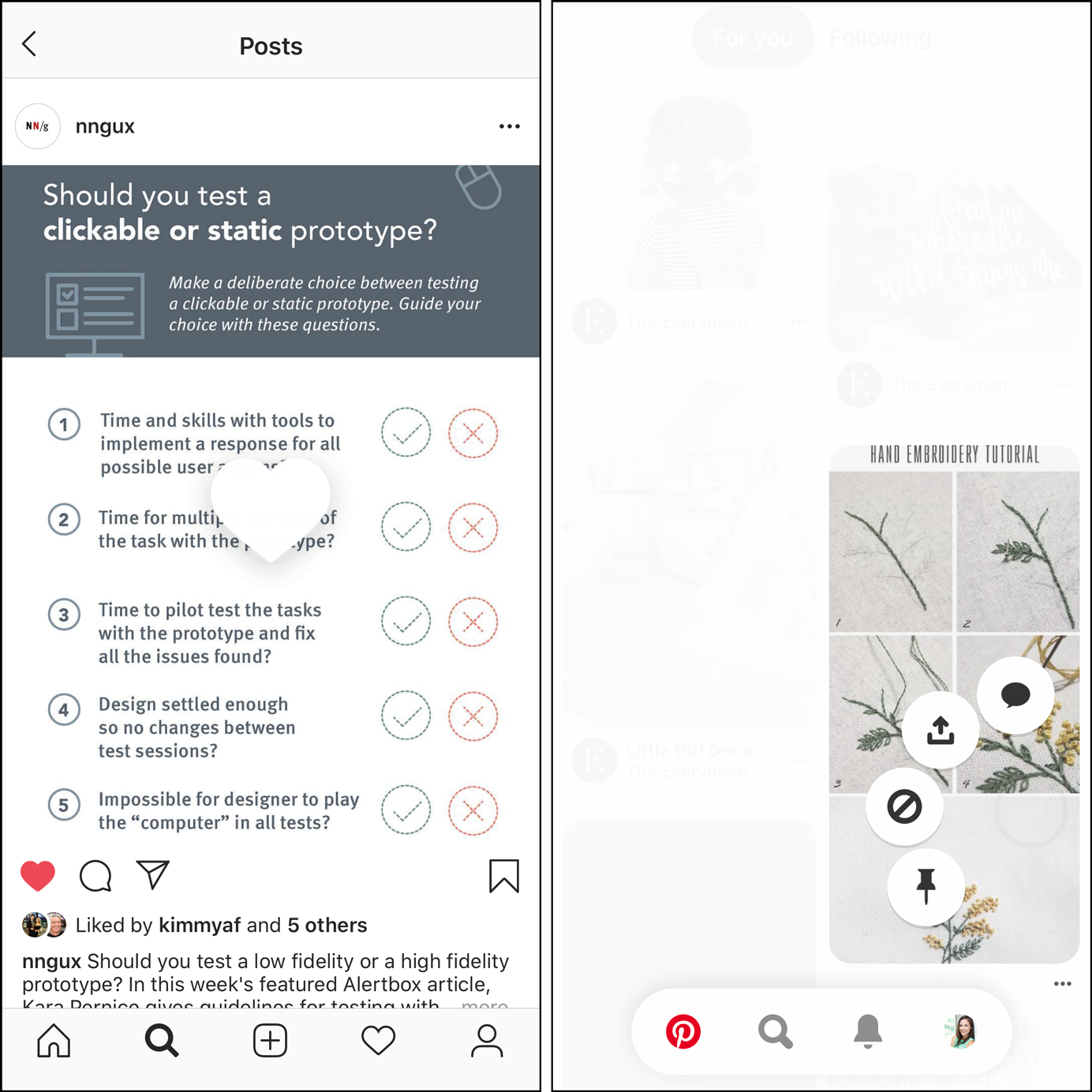
- Touch gestures (e.g. long press, double tap, swipe).
Accelerators make the system more flexible and efficient to use. Such a system will allow both experienced and inexperienced users to perform the actions in the most convenient way.
Typically, users reach a plateau in efficiency after fully exploring the interface, when further repetition does not shorten the task execution time. Using accelerators helps experienced users overcome this plateau by adopting a faster method of accomplishing the same task.
When do you need an accelerator?
Not all actions in the system require an accelerator. Focus on the routines that people have to do the most on a website. Remember that learning requires repetition, so people learn a label better if they repeat the action systematically. It’s also worth simplifying and speeding up the actions and features that you want to get your customers to use. If they become interesting to users, both you and they will benefit from it.
Keep in mind that this is an additional way to take an action. People who never use them should be able to accomplish the same task in a different way, so that it’s not all the same and boring all the time. Finding these different ways should not require complex search and study. Your strive doesn’t have to be to introduce new users to each and every accelerator. They should just be able to complete the task they want to complete in such a way that they understand the basic functions and overall usefulness of the system. Only users who have grasped the basics of the system and want to use all its features should have access to the appropriate shortcuts.
At the same time, no one knows when the user will be “ready” to learn the accelerator. Some are never ready for it. Therefore, accelerators should be readily available, but in a way that they can also be ignored.

Accelerators location and view
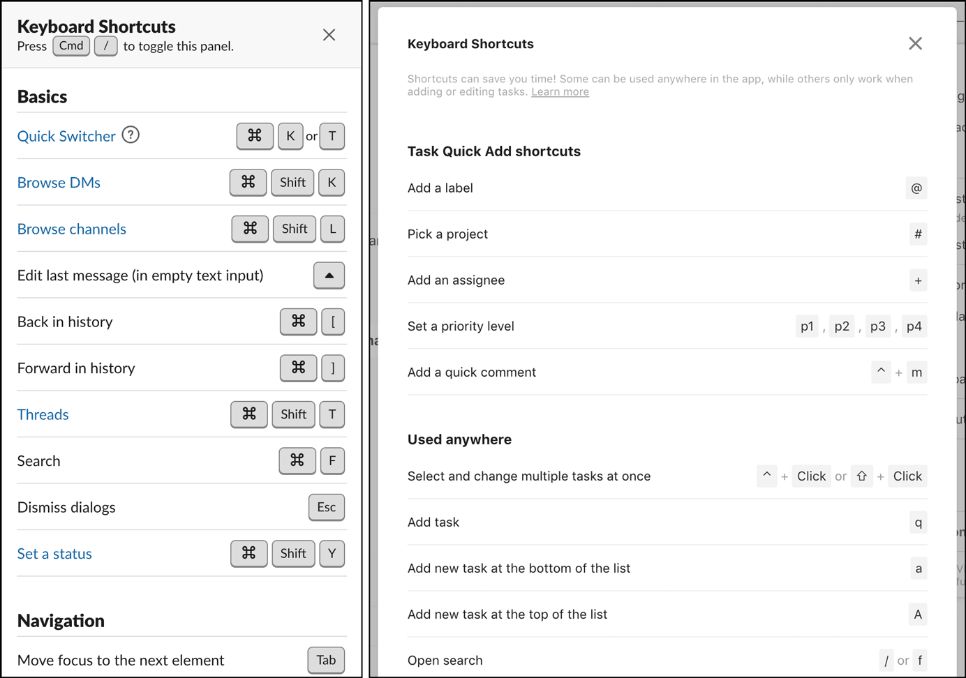
Keyboard shortcuts are usually displayed next to the corresponding menu shortcut, so power users look for them there. Be sure to visually style your keyboard shortcuts so that it doesn’t have to compete with the brand’s label.
The label can be displayed right-aligned in a drop-down menu (if the menu labels are left-aligned), displayed in parentheses, or in a different color.
If there is no text label, but only an icon (which we do not recommend), the label can appear inside the tooltip along with the element label. However, remember that the feature will not be available on the touchscreen though.
If for some reason (for example, the accelerator is a touch gesture) you cannot display a shortcut next to the action icon, a tooltip may be the only way to open the accelerator. In this case, it is best to wait for the user to complete the action in the standard way, and then display the prompt. This context-sensitive help ensures that users receive all the instructions they need. Make the prompt short and easy to read, avoid long or multiple instructions in a row. Focus on one action and its label.
Complex accelerators such as macros or other customization and automation tools should appear in their respective customization screens or navigation menus.
The last important thing is to create a list of all the shortcuts available on the system in the help documentation. This option is the most hidden one, but for the part of users who are worried about optimizing their workflow or have forgotten the exact shortcut, the cheat sheet guarantees a reliable way to get information.

Our experience
Here at Angle2 we create Saas UI/UX with the thought about making our users’ experience as great as possible. We carefully study the users and get answers to basic questions. How often and how do they intend to use your product? Every day, once a week, constantly moving or sitting at the computer? It all matters!

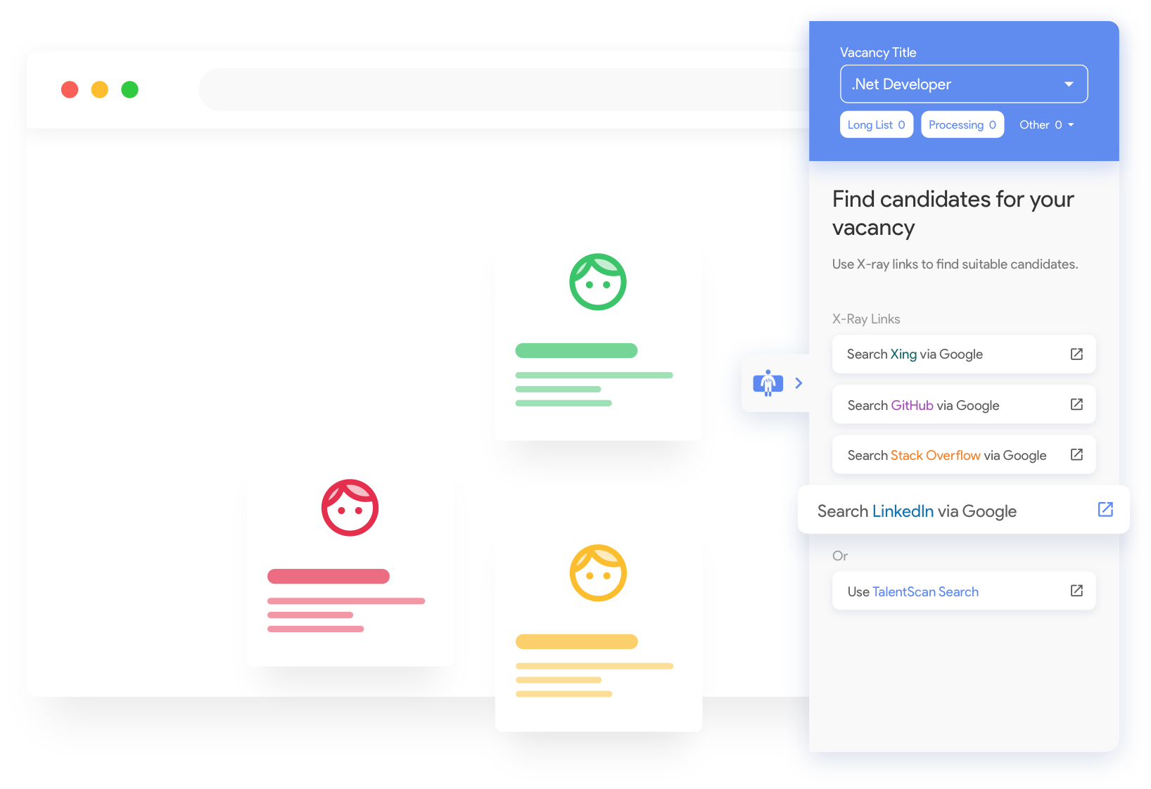
For example, Talent Scan, where we interviewed different people.
In addition, we create a journey map, which gives a good understanding of the user and the processes used by him or her.
You need to be ready to immerse yourself into the complexities of different professions. We have worked on a medical system, a system for lawyers and in many other specific areas, and of course it required us to take the time to study all of it in order to come up with the best and most optimal solutions.
With the help of training on similar tools, it is not always possible to find a product with exactly the same purpose / functionality, but you can always find something similar for sure. In the case of SaaS, even applications from a different realm can be beneficial. For example, Salesforce, a huge SaaS system, covers many different purposes and it can be learned about from using almost any other similar system.
Ease of use is very important, but not nearly as important as performance optimization. The time spent learning the complex steps will pay off when the task takes less time to complete. The user will get the job done faster when fewer steps are required. At the same time, we pay huge attention to usability and ease of the interface.
It’s important to stay creative when working with multiple spreadsheets. When working on a SaaS project for a long time, you usually need to insert a lot of tables after the first half of the work. And you need to be able to abstract and always think about alternatives.
We always take into account the possible growth of the system, trying to see the bigger picture and accurately understanding which direction the application is moving towards in the future. We lay a good foundation during the design phase of the system in order to help create simple new sections when needed.
Conclusion
User-oriented design impacts customer experience and plays a key role in building brand awareness. This is an important milestone on the way to a successful business. However, many tasks facing a web designer are not always easy to solve yourself.
If it is a hard task for you or you just don’t have a lot of time for it, contact our specialists. The Angle2 professionals will help solve your SaaS UX problems with the proven solutions!


