User experience (UX) design offers users a product that provides meaningful and relevant experiences to them. No matter what UX strategy the designers are following or what goals they are setting out to achieve, a user is your starting point. User-centered design means you are sensitive to the users’ needs for all aspects of design and development. It is the appealing UX design and unforgettable brand contacts that build strong emotional connections with their users. Interests, perceptions, and attitudes shape the behavior of today’s consumers.
You might be thinking that UX design deals with the colors and the interface. Aren’t UX design and UI design the same thing? In fact, the term ‘User Interface Design’ is an essential aspect and subgroup of UX design that covers a lot more than just appearance. UX design is about acquiring and integrating a product. A UX designer engages in developing the brand, the design, testing the usability and functions.
Step by Step Guide to User Experience Design Strategy
What is UX strategy? It is a detailed program to align a company’s brand identity with the desired user experience to stay ahead.
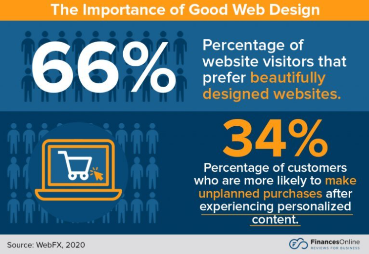
A strong UX strategy makes sure that the team concentrates on solving pressing issues for their target audience by using relevant insight and reasoning. A UX strategy develops coherent episodes from every user point of contact. Successful UX strategies result in increased customer satisfaction and brand loyalty. According to 99firms, 90% of consumers will continue shopping if they get things done easily and enjoy the website’s UX design. At the same time, almost 94% of negative feedback from users is related to poor design.

Step 1 – Plan and Research
When you want to analyze the present state of affairs, the most suitable question is: “Where is the product now?” By answering it, you will understand the problem you need to solve and set the objectives. Moreover, you will be able to learn about your product’s most crucial issues and determine the activities needed to reach your goals. UX strategists leverage resources to study product processes, management, place on the market, and staff.
Using your project’s goals, requirements, and budget, we run different types of research. User research, competitive research, creating personas and user flow, card sorting, and interviewing are the most effective practices in our experience.
Step 2 – Design
The next step is analyzing the information you collected and making connections around it so that you draw some conclusions. As if you are drawing a map to your goal and choosing the best route. Creating this roadmap helps us understand what users will be going through when using the product or service.
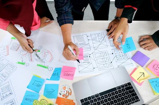
It is a good idea to use colored sticky notes to map out what feelings or emotions you want people to experience when they deal with the product, at every step of the way. Think about the emotions your product would evoke. Imagine what they might feel when they shop on your website. That is what a good UX strategy example does – it interacts with you.
Step 3 – Refine
Once you have reached Step 2, it means you have a clear understanding of users’ issues that your product would help solve. All of this will help you brainstorm and come up with the right strategy and solutions through sketch design: from a wireframe to a prototype. The right mixture of components you use on the page influences your brand’s identity, style, and target users. UX design helps achieve the necessary goals. In one of his strategy books, Don’t Make Me Think, Steve Krug gives some fundamental advice on interface usability. His main idea is not to overload the interface. Complex problems need complex solutions but require a simple and intuitive UI. Thus, it will appeal to customers because they will feel more comfortable and able to navigate your website easily.
Test the design, get constructive feedback, and do it again. Iteration and critical feedback move your design process along.
UX Design Strategy Process: Behind the Screen
It is a breathtaking experience to release a completed product. To help a client launch their new or renewed projects and get positive feedback from them. Behind every great product, there is a team of project managers, developers, testers, promoters, researchers, and managers.
The Angle2 team of 7 (project manager, 2 UX designers, 4 UI designers) started with a kickoff meeting when NeoDeck Holding asked for help in designing a new UI for Electronic Health Record System. The previous 16-year-old software was outdated and unwieldy. Though much revised, it still was inconsistent.
The onboarding and research included interviewing local healthcare workers and the EHR stakeholders and conducting surveys. We studied the market as well as the concept and purpose of the product. The data helped us see how EHR was doing against competitor products. The competitive evaluation also allowed us to find out what competitors were offering, their strengths, weaknesses, and how they were attracting and retaining customers.
This design stage was one of the most demanding ones. The project manager gathered all team members together to explore and generate ideas. Collaborative workshops and brainstorming sessions usually bring a lot more concepts than thinking on your own. The team collectively decided which ideas were worth moving forward with.
Once the planning and research stages were over, it was time to design an ideal map. Angle2 tried sketching a product map. We failed to connect the dots. EHR turned out to be a complicated system. We took a break and drank 2 gallons of coffee to get our heads together and decided to work in stages: small maps for each module to the whole map.
Another challenge was the designing of a screen prototype, including navigation and general layout. Since it was the first draft of the new interface, it was an example of the team’s results, efficiency, and professionalism. Moreover, the page interface shows whether you see eye to eye with the stakeholders. Sometimes things that turn out crucial for the target audience never even cross the clients’ minds. Wireframes benefit from initial design ideas and feedback on the design before you invest time in high-fidelity prototypes.

While developing the UI, the designers worked with Fuse – Angular 8+ Material Design, since this style was the most coherent and well-defined. Atlassian was chosen as the optimal design system for this project because it arranged the content effectively and sustainably. We also developed patterns and elements, chose the fonts, and developed the UI language. The crucial point was testing, testing, and testing again. Before the launch, our team of developers wanted to make sure that the new EHR yielded reliable results.
The process lasted eight months. Angle2 created an all-inclusive complex system with simple navigation.
Angle2 creates simple and impressive UX designs – an aid in growing faster than the competition and a powerful tool for improving customer acquisition. We are here to help businesses solve their design challenges.


